
THE KVB DESIGN INSIGHT
The BIG Question:
What makes a perfect façade?
What every retailer needs to know about designing a storefront that ‘works as hard as you do’, from brand visibility to building ownership.
The façade is not just a logo on a sign. This is perhaps the most important distinction we make when we begin any retail façade design project. A sign tells people where they are, a great façade tells people who you are, what you stand for, and why they should come inside, in the few seconds they have as they pass by on foot, in a car, or from across a retail park.
A façade should communicate what is sold inside with clarity; establish the brand with confidence; take visual ownership of the building it occupies; and attract and invite the right customer.
When all of these work together, through the right combination of logo, signage, window treatment, lighting, colour, material, and scale, the result is not just attractive. It is commercially powerful.
”"The best façade doesn't shout, it invites. It makes the customer feel, before they even step inside, that this is a place that understands them."
Matt GreatbatchManaging & Design Director, KVB Design
THE KVB FRAMEWORK
Asking the right questions:
5 questions for a façade that performs
01
Is your logo designed for the façade?
Logos are rarely created with exterior scale in mind. How does yours perform at 6m wide, read from 20m away, on a variety of architectural backgrounds?
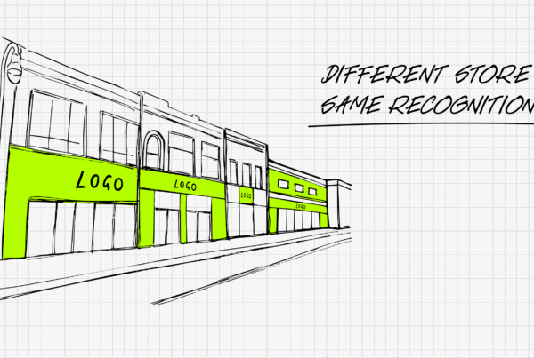
→ A façade concept that aligns visual identity across multiple store formats and sizes.
MULTI-FORMAT SUPERMARKET CHAIN – ROMANIA
02
Does your brand own the building?
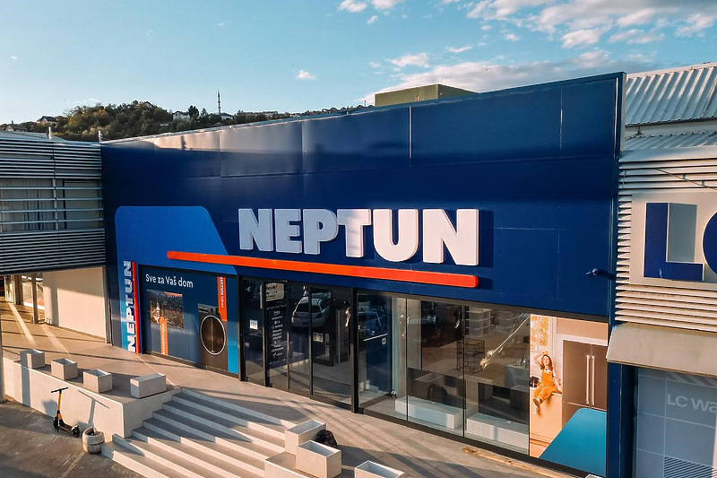
You are paying for that frontage. Does your façade make full and confident use of every square metre available to you?
→ At Neptun, the bold façade colour defines the brand, takes ownership of the façade and product showcase windows to make the store work from the street level.
HOME ELECTRONICS RETAILER – BALKANS
03
Is the design scalable?
If you have multiple sites, do they read as one brand? If you have more than one retail location, your façade must be consistent enough to build brand recognition, yet flexible enough for different buildings.
→The Coffee Island brand icon, used consistently at the right scale, becomes a beacon, something customers recognise before they can even read the name.
500+ STORES – 13 COUNTRIES GLOBALLY
04
How does it perform at night?
Lighting is not an afterthought; it is part of the brand identity. A well-lit façade extends your trading visibility and transforms your store after dark.
→ Germanos uses its façade to reflect an innovative and technology-led brand identity to make the store work from the street level.
TELECOMMUNICATIONS RETAILER – GREECE
05
Does it work at every distance?
Your façade must perform at multiple scales simultaneously: from across the street, from a passing car, and up close as the customer approaches the door.
→ New store opening for Waring Bakery positioned communication to address customer traffic direction and introduce the brand to a new audience.
LOCAL BAKERY – UK

THE LESSONS FROM OUR WORK
TALLINN, ESTONIA – URBAN SHOPPING CENTRE – MULTI- ENTRANCE DESTINATION
Viru Keskus, shining a light on Estonia’s retail landmark
The façade gets customers to the door. But at the scale of Viru Keskus, one of Tallinn’s most significant urban retail destinations, that principle operates across an entire city block, from every direction, at every hour.
When KVB Design were engaged, the challenge was the same one every retailer faces, just magnified: what does a customer see at 100 metres, at 10 metres, and at the entrance itself? Does each distance tell a coherent story?
We built the answer around four layers. Perimeter signage is consistent across all elevations, so every approach route reads the same brand with the same confidence. Entrance architecture with a shared visual language, making arrival feel deliberate rather than accidental. Lighting is integrated into the design, not added as an afterthought, ensuring the centre is as visible and welcoming at 8pm as at midday. And car park identification is readable by drivers at speed, without ambiguity.
The same thinking that applies to a single window display applies here: remove confusion, establish hierarchy, and make every touchpoint earn its place.
The result has stood the test of time. Signage, entrance treatments, and lighting all remain in place and still performing, perhaps the most honest measure of whether a design decision was the right one.

Tip of the Month
Stand across the street and time your message clarity. Five seconds is the benchmark.
Audit your store for entrance legibility. Is it obvious where to go?
Test whether your price position is visible from outside. If not, reconsider the hierarchy.
If your storefront isn’t working as hard as you are,
let’s talk…
We work with retailers of all sizes, at every stage of their journey. Whether you are planning your first store or evolving a network of hundreds, we bring the same curiosity, rigour, and commercial thinking to every façade we design.

What’s Next?
You’ve brought the customer through the door. Now the store itself has to do the selling. How layout, light, and product placement turn visitors into buyers.